Today the elements have been aligned to write this post, in my newly released blog 360 Soluciones Cambio Climático. Somehow I wanted to reflect what our logo means, what we want to convey with our corporate image, but above all thank the designers who have helped us make 360 Soluciones a reality, Inés Lara and Viqui Rotili.
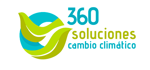
When 360 Soluciones was born I asked my great friend and designer Viqui Rotili to create our logo. I commented that we would like to convey the image of a company sensitized in looking for solutions of sustainability and mitigation of climate change. That we wanted our planet to remain blue. What has always motivated me the phrase of Al Gore that says we have to be the generation that did what should. And what we would try to look for solutions from a global perspective, hence the number 360. Although my indications were not very precise, she knows me very well and knew immediately what was the idea I had in my head.
Much further, Viqui designed a logo that mixes all concepts, a circular image that rotates to make sense of the number 360 and the blue planet, and most importantly introduces a "ring" with two faces that wraps the earth and represents the action of man on it, so the front of the ring is the leaves and the back part is what looks blue. The ends of the band are the two leaves. At the end, the image is the flat representation of a ring making a twist, so the top sheet when crossed with the blue part casts shadow on the back and better represents the volume. But the most important is that she wanted to convey the idea that human action should be aimed at making the world more habitable, so when touring the ring changes to a "natural" way. In addition, the negative of the leaves makes an "S" of Solutions and the circle behind makes two "C" of Climate Change.
From this image to everything that our website transmits is the work of the programmer and designer Inés Lara. She also knows me very well. Our website is our showcase to the world and I can’t imagine any that represents us better than ours. Simple, practical and reflecting the sustainability ideas we work with.
The two, Ines and Viqui, Viqui and Inés, are part of the two sides of the ring that envelops our image every day, and that when touring make the ring change to a more natural way. Thank you very much.